Publication Design
Pareto Education's Guide to Clinical Practice
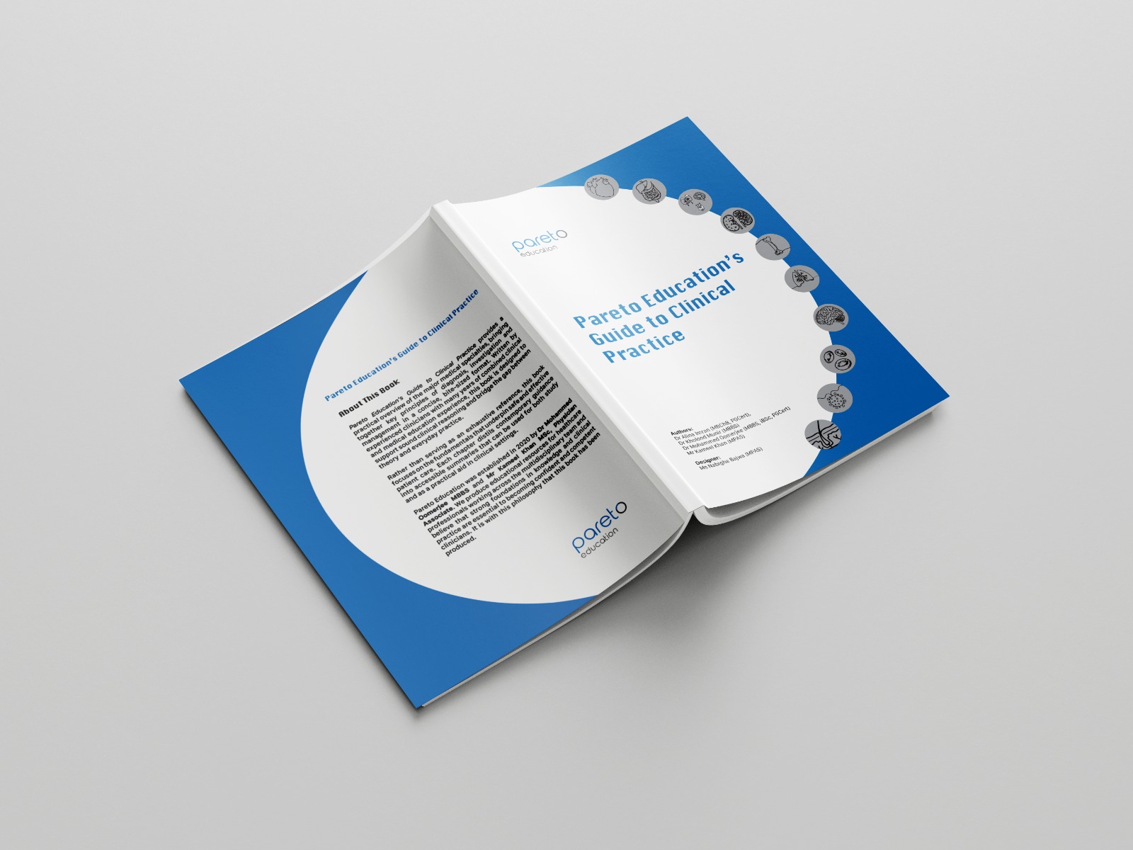
A clinical reference of more than 300 pages for medical students and early-career clinicians: cover, colour-coded specialty system and page layout.
- Client
- Pareto Education
- Year
- 2026
- Role
- Book design: cover, typographic system, colour coding, layout of more than 300 pages
- Disciplines
- Publication, Print
The challenge
A clinical guide is used under pressure. The reader is on a ward, between patients, looking for one condition in one specialty, and the book has to get them there in seconds and then be readable at a glance. Many specialties, hundreds of conditions and a mix of text, tables and anatomical figures all have to sit inside one calm system.
The approach
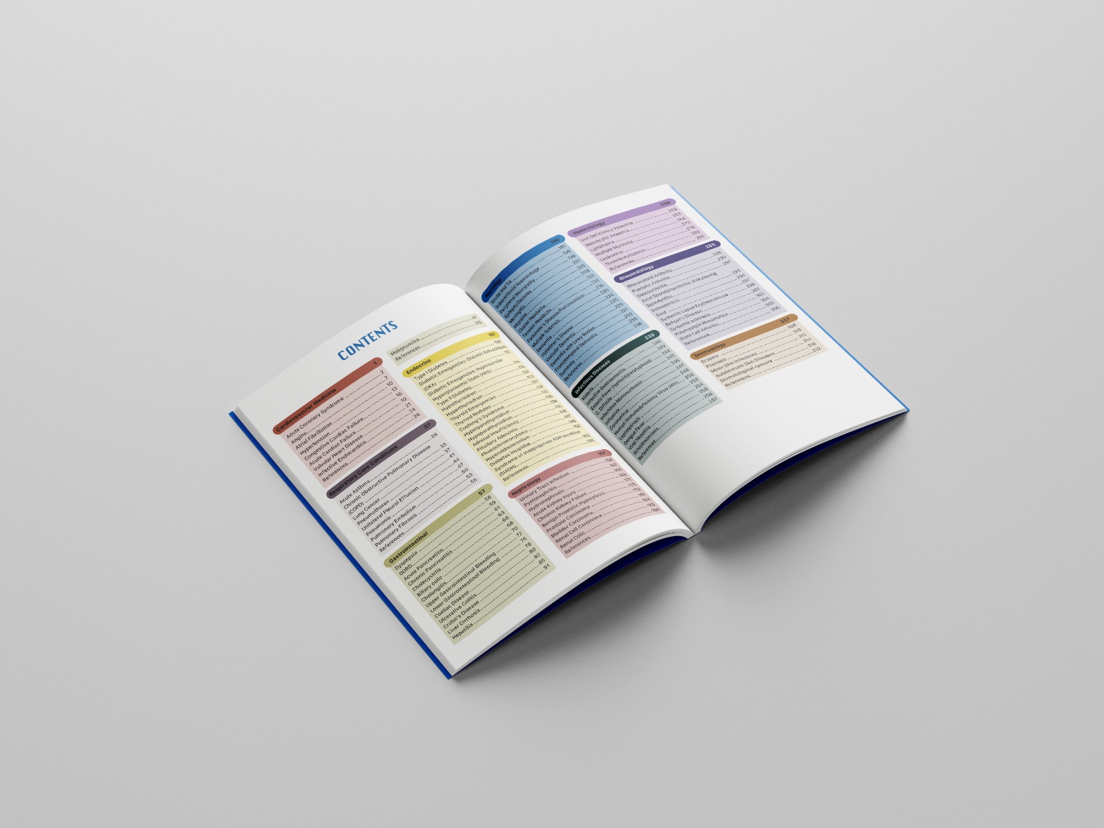
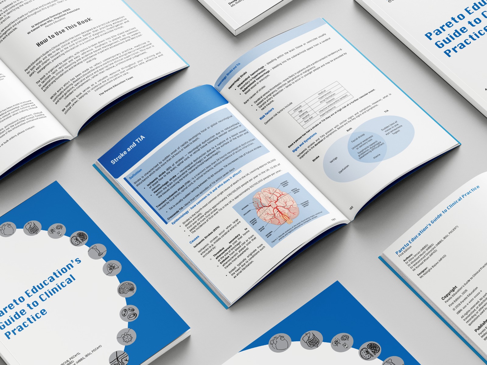
Each specialty was given its own colour, carried from the contents spread through the chapter openers, so a reader can find cardiology or neurology by colour before they read a word. Inside, every condition follows the same order: definition, epidemiology, causes, risk factors, signs and symptoms, so the eye always knows where the next thing is. Tables and figures sit inside the text column with generous space around them, and the cover reduces the whole book to a ring of specialty icons around the title.
The outcome
A reference that can be flicked through by colour and read by structure. First edition published in 2026.