Publication Design
El Seed
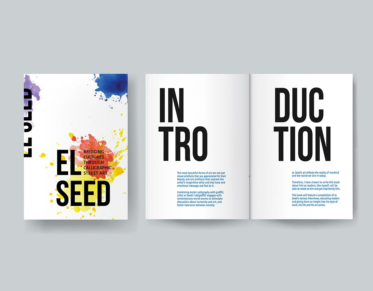
An editorial publication on the calligraffiti artist El Seed — typographic system, grid and image pacing.
- Role
- Editorial design, typographic system, layout
- Disciplines
- Publication, Print
The challenge
El Seed's work is dense, gestural and highly saturated. A publication about it has to hold that energy without competing with it — the risk is a layout that shouts back at the artwork and leaves the reader nowhere to rest.
The approach
I built the book on a wide, generous grid with deliberately large margins, so full-bleed artwork can breathe and text columns stay narrow and readable. A single serif family carries the display and body voice, sized in a tight scale so headings feel calm rather than loud. Image pacing alternates full-bleed spreads with quiet, mostly-white text pages, giving the reader a rhythm of loud and soft across the publication.
The outcome
The result is a publication that reads as a gallery rather than a magazine: the artwork is the only thing making noise, and the typography stays deliberately anonymous in service of it. Design intent described here; production and distribution details to be confirmed.